
Tutorial Assets
- Brushes
- Speckled texture
- Watercolor Texture 1
- Watercolor Texture 2
- Watercolor Texture 3
- Peasant 1
- Peasant 2
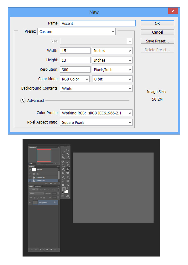
1. Prepare the Canvas
Time to begin! I work at a resolution of 300 dpi, though the size constantly varies as I crop for compositional purposes. Painting on pure white can be intimating, so I prefer toning the canvas with a neutral gray using the paint bucket tool.I like setting up my tools to show layers, history, and a navigator. Seeing images from a distance helps you catch overlooked mistakes which makes the navigator useful. It also keeps your mind on the big picture, especially when detailing later.
2. Create Your Sketch
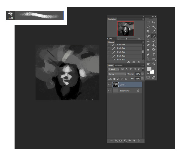
Check out those blobby values. No need to be refined at this point. I like using a chalky brush to set down my basic layout. The slightly textured edge makes it my all time favorite brush, and I use it for 90% of my process.I prefer starting in black and white. When it comes to readability, value is key. When value hierarchies are strong and clear, then all is well. Color comes secondary and introduced much later (though it's my favorite part and hard to resist)!
3. Refine the Structure
I jump right into the facial structure. Again, detail isn't important tight now as long as the overall anatomy reads. When it comes to face, often less is more. A simple shape can more effective than detailed contours. Pay attention to lighting, and when in doubt, keep a mirror handy for tricky anatomy.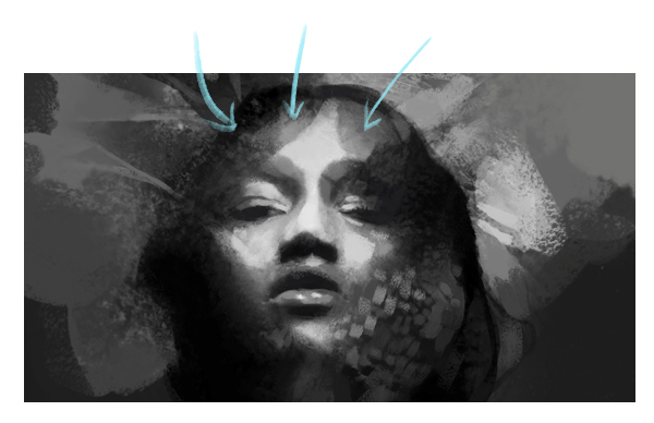
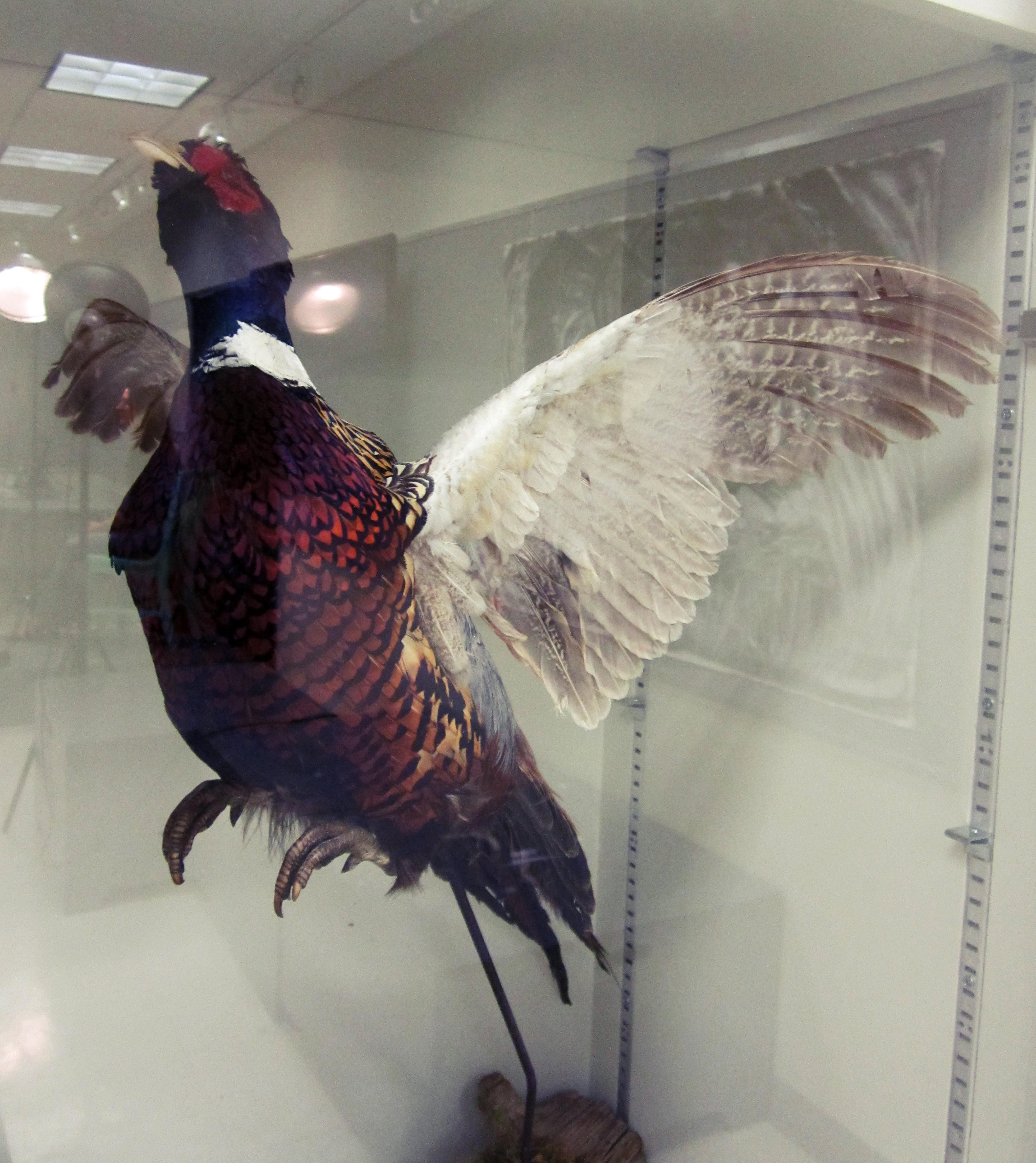
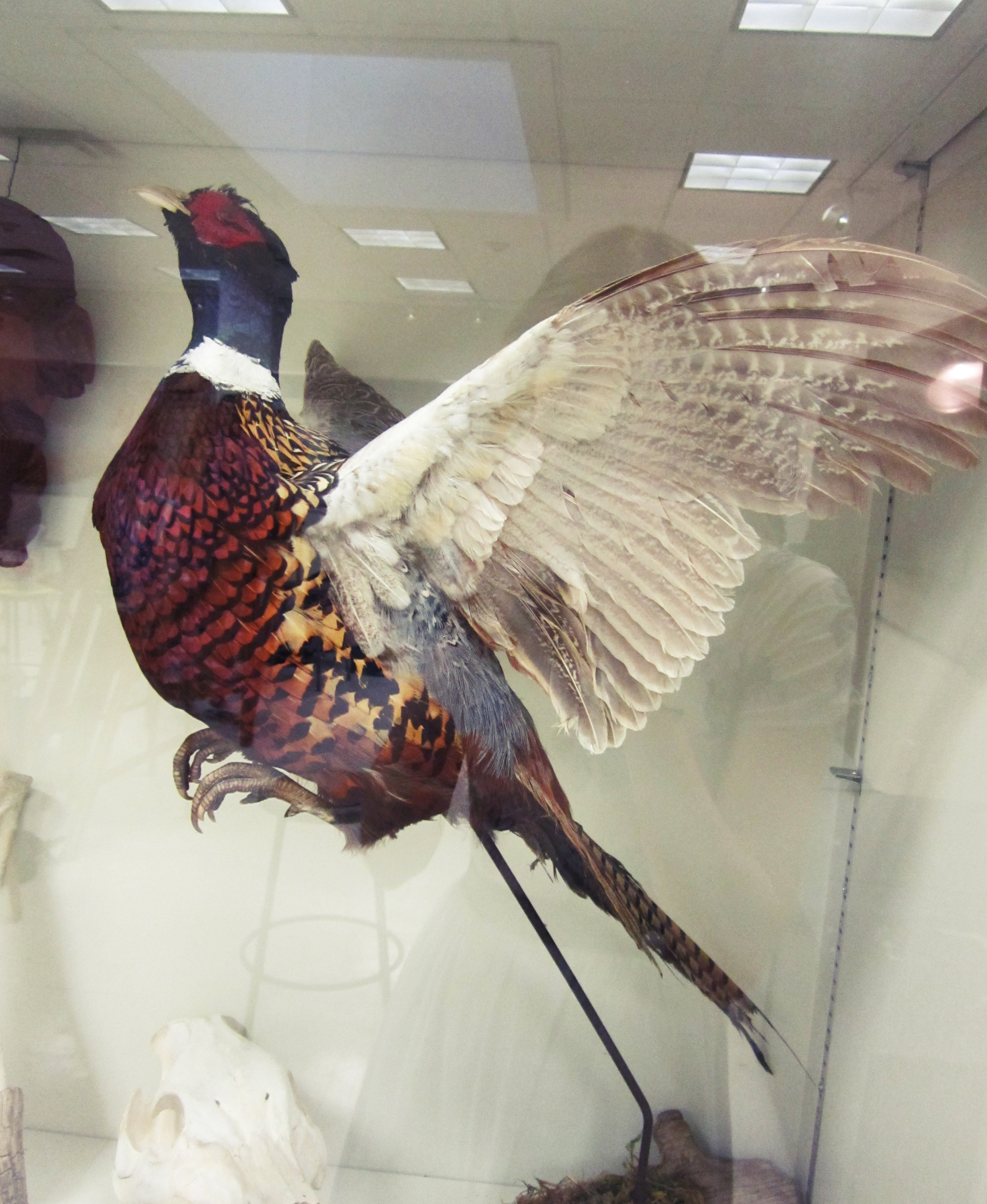
4. Use References to Draw the Wings
Compiling references is convenient at this point. I have a pair of pheasants photos, whose textured plumage could be useful for this piece. I try carrying a camera with me often - you never know when something inspiring might jump out at you. I drag the images onto a fresh document and keep them near the corner of my workspace.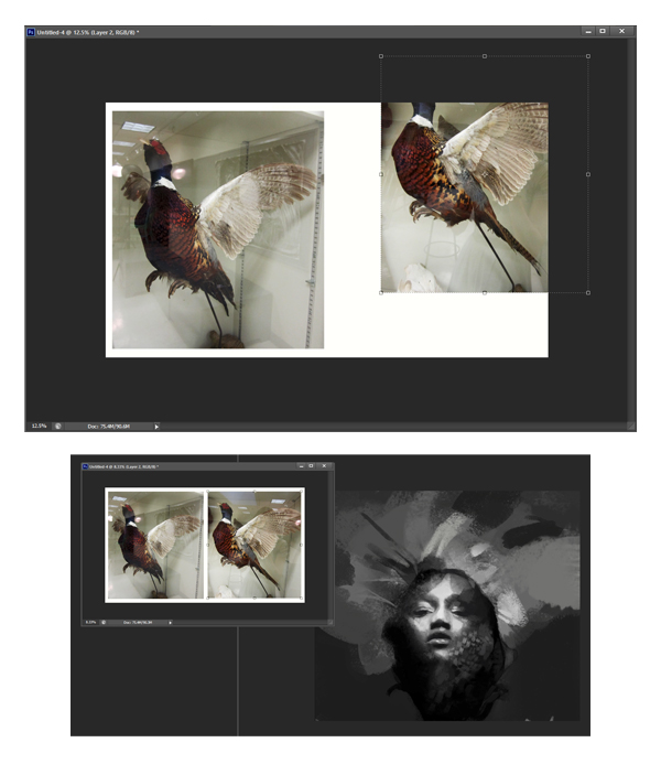
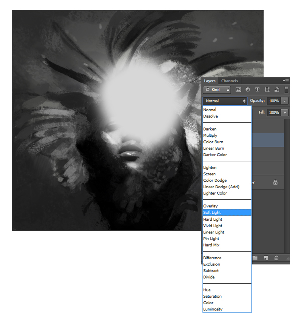
5. Adjust the Lighting
I love using Blend Modes for lighting and color effects (particularly Overlay and Soft Light).Here, I add a central glow by laying down a bold, airbrushed highlight on a separate layer. Next, I go to the settings in the top left corner of the layers section and choose 'Soft Light.'
6. Add Texture to the Composition
Step 1
Textures! Fun to make, and even more fun to manipulate. There is plenty of of stock out there, but if you're feeling crafty, grab some watercolors and go for it. For the best quality, scan them as high res as possible.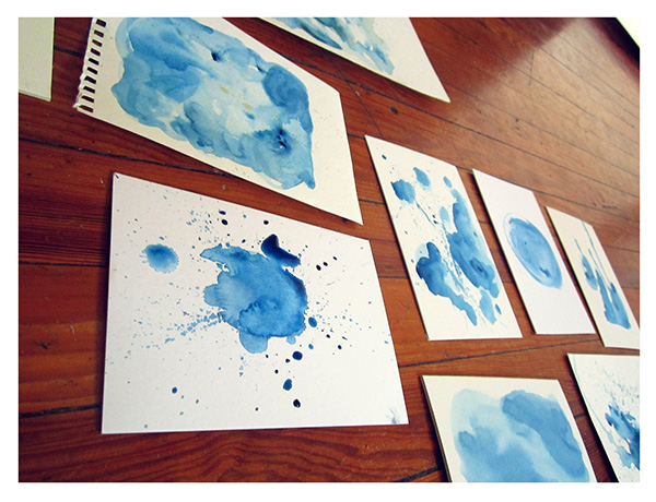
Step 2
Using textures provides a lovely, traditional effect in contrast with a smoother, digital look. It allows for a sense of spontaneity and experimentation. I tend to collage a series of textures over my rough sketches as a base for adding detail later. After placing my desired texture onto the sketch, I set the Blend Mode to Soft Light.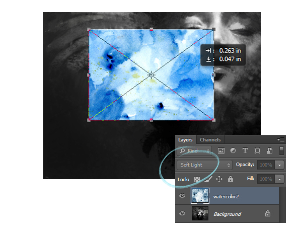
Step 3
I then transform the texture to cover the entire image, and use Image > Adjustments > Black & White to desaturate. Once my texture has been formatted, I go to Image > Adjustments > Brightness/Contrast and fiddle with the settings until it appears seamless.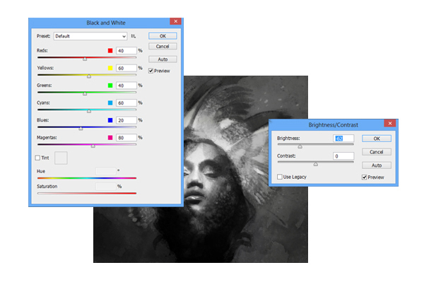
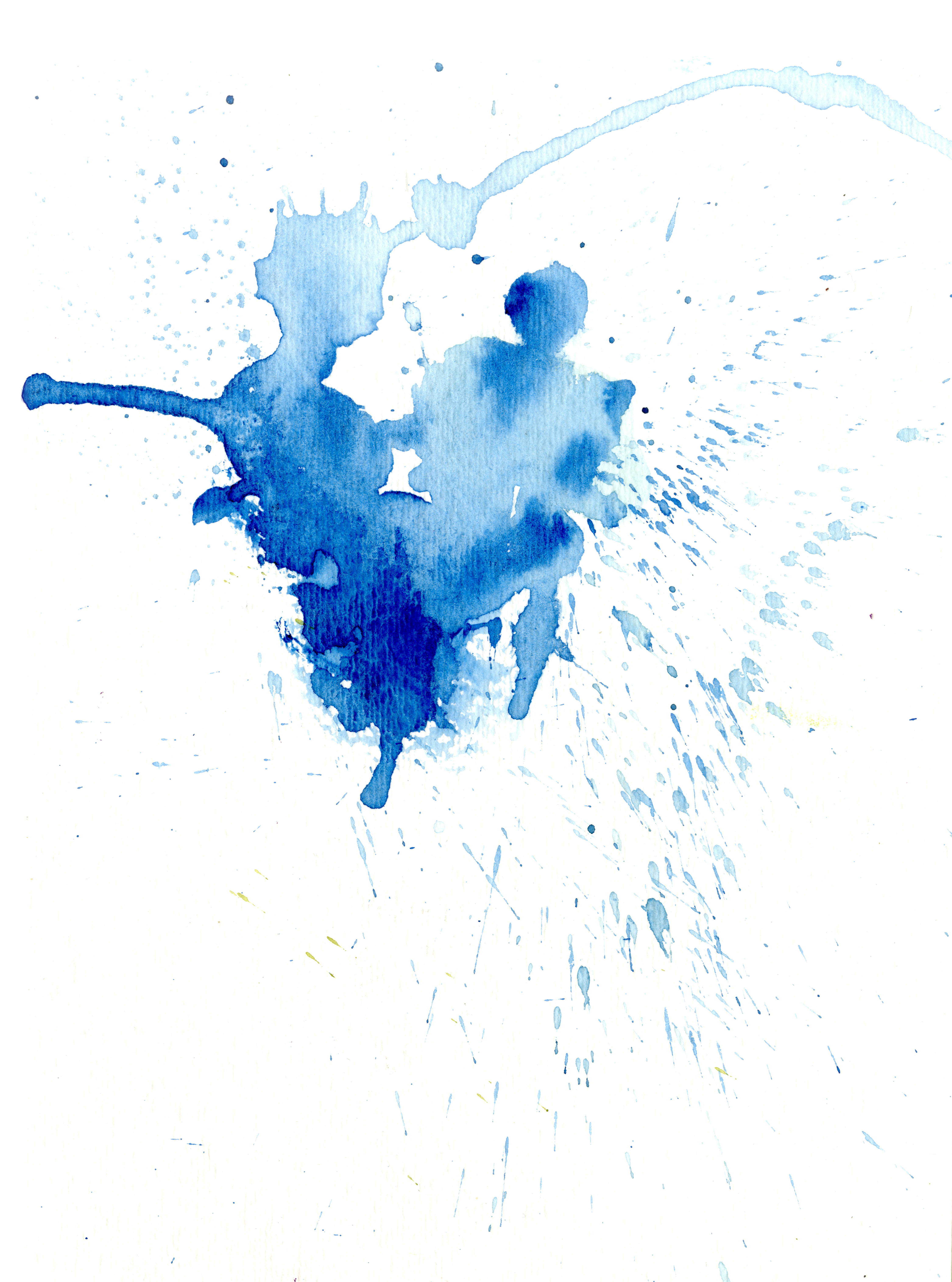
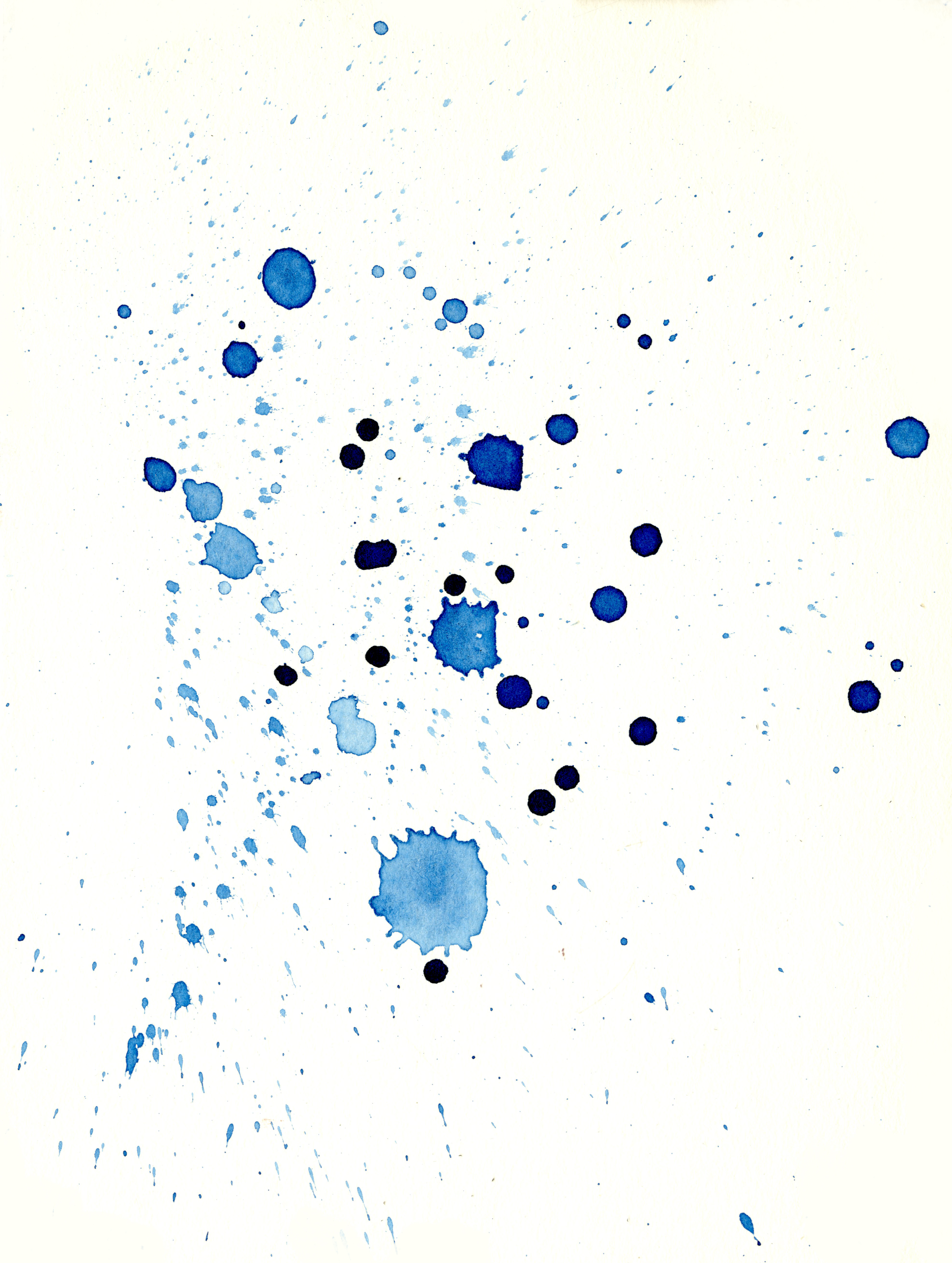
7. Add Drips and Splatters
Step 1
In addition to the overall atmosphere, textures are great at adding quick hints of detail here and there. This is when I lay down splatter and drip layers throughout the piece on various layer modes. After desaturating the splatter, I set the mode to Multiply which eliminates the white. I transform it, erase out certain areas, and lower the opacity for a natural appearance.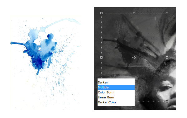
Step 2
Using the drip texture, I follow a similar process. Only this time I set the mode to Divide which inverts the texture and creates cool pinpoints of gray and white.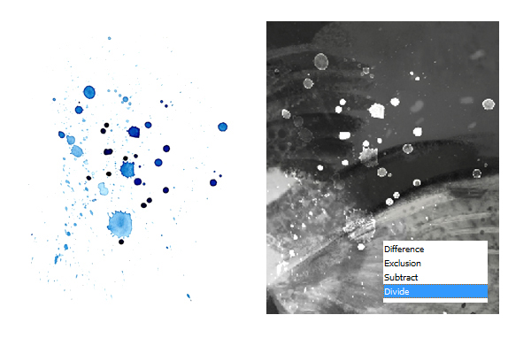
8. Refine the Face With a Sharpe Brush
Using a sharper brush, I begin refining the face and feathers on a separate Overlay layer. This brush is great for adding line and detail.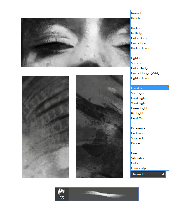
9. View the Composition With Fresh Eyes
Step 1
Flipping the canvas horizontally allows you to see the piece with fresh eyes. All the glaring mistakes jump out and it can be extremely helpful (though sometimes a little disheartening). To flip, go to Edit > Transform > Flip Horizontal.
Step 2
After seeing the mirror image, I notice some issues with balance, so I select an area I'd like to manipulate. Again, I go to Edit > Transform and this time I choose Warp. This allows you to fluidly move the selection using many different anchor points.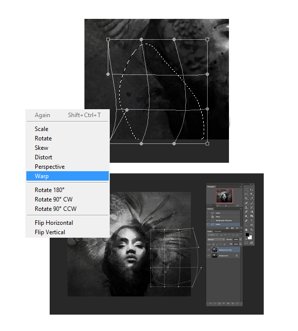
10. Use an Airbrush to Blend Your Design
At this stage, I want to smooth out the textures and details for better cohesion. On a separate layer, I select a soft brush and lightly add tones of gray and white throughout the piece.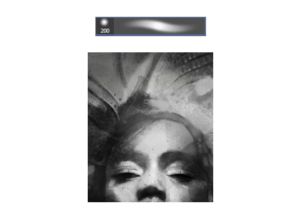
11. Let's Begin Adding Color!
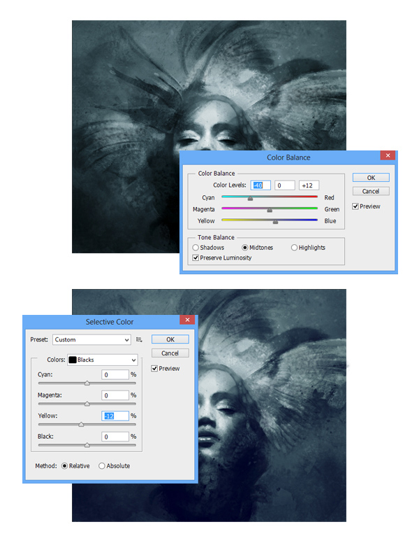
Step 1
Time to prep the sketch for color! I like to keep my palette limited and consider using a predominantly blue color scheme with yellow highlights.First I go to Image > Adjustments > Color Balance and shift the image to cyan. The shadows are a little dark, so I use Image > Adjustments > Selective Color and choose Blacks in the drop down menu. By pulling the Yellow slider the left, the black tones become a lighter blue.
Step 2
Curves is another convenient color technique. At the bottom of the layers menu is a circular icon representing a new fill or adjustment layer. From the options, I choose Curves. There are a few color setting to choose from - my favorite is the blue one. I pull points up and down on the graph for a vintage effect.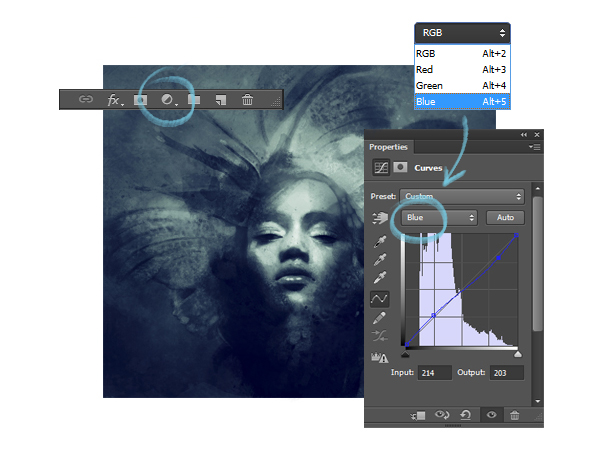
12. Add a Gradient
To create a focal point, I like using the Gradient Tool from the paint bucket option in the toolbar. In the top menu I choose the radial gradient and edit the settings according to my color preference. After laying down the gradient on a separate layer, I lower the opacity and set the Blend Mode to Soft Light.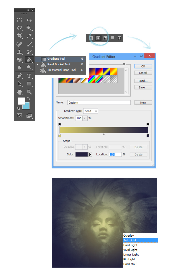
13. Add Color Accents
To create color accents, I add a new layer and set it to Overlay. Using a saturated yellow, I lightly paint swatches of color in various areas - particularly around the eyes.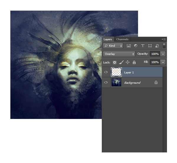
14. Refine the Face Details
I haven't been zooming in much, but it's time to start working on the face and expression. Using both a sharp and chalky brush, I add details around the eyelashes, eyelids and lips. I constantly color pick from the surroundings with the eyedropper tool to retain a consistent mood.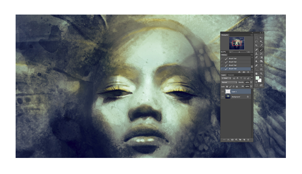
15. Adjust the Composition
When it comes to color, I can be incredibly indecisive. I realize I prefer a bluer color scheme, and mute some of the yellow highlights using the color techniques as before. Again, I flip the canvas horizontally and warp the face for a better symmetry.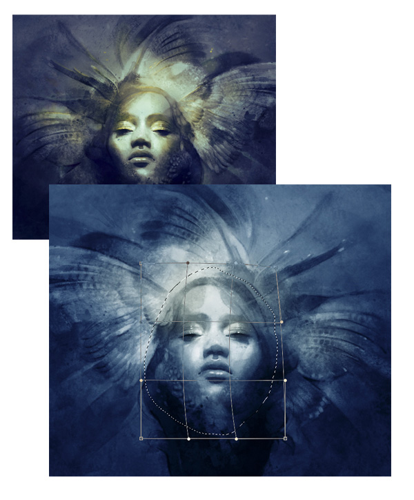
16. Add Details to the Feathers
After focusing on the face, I add more detail to the feathers. I keep my reference close as I rework the shapes and figures. It's not necessary to follow the photo exactly, and I often like balancing detail with gaps of softer, unfocused areas.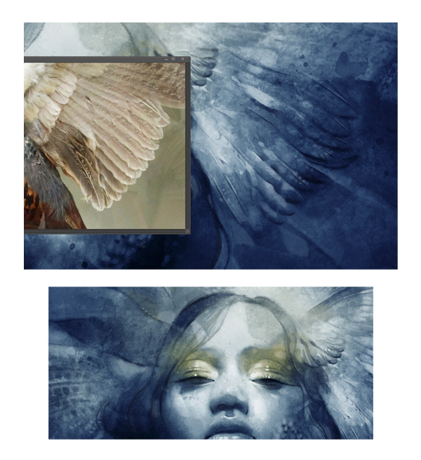
17. Add a Speckled Effect
I never stop adding textures, and here I place a speckled, grungy surface on the painting. I set the layer mode to Divide, move the texture to the corner, and erase away the edges. Then I go to Image > Adjustments > Hue/Saturation and make sure to click the Colorize box to keep the tones uniform. I play with the sliders until I have a color and value I like.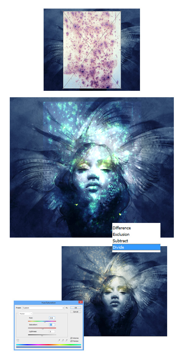
18. Use Textured Brushes
When it comes to adding finer details, I like using a few of the these brushes. The first streaky brush is great for adding subtle hair strands and lines around the eyes. The dotted brush below is useful for adding both dark and light contours. It creates a broken, uneven line which simulates the effect of a fine, dry brush.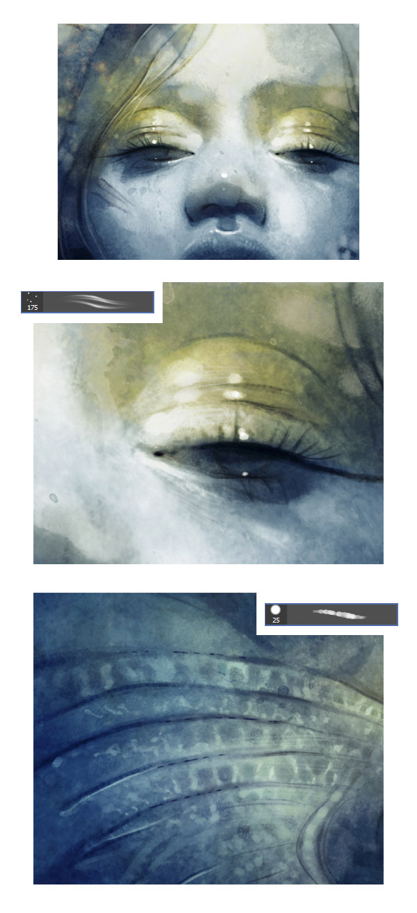
19. Color Alterations
More indecision! At first I try adding a soft pink shine around the figure's face on a Soft Light layer. However, I decide that green and yellow might be more striking. I shift the hues using color balance, but save my previous layer. Sometimes, I realize I've made a huge, spur-of-the-moment mistake, and like the insurance of saving my steps.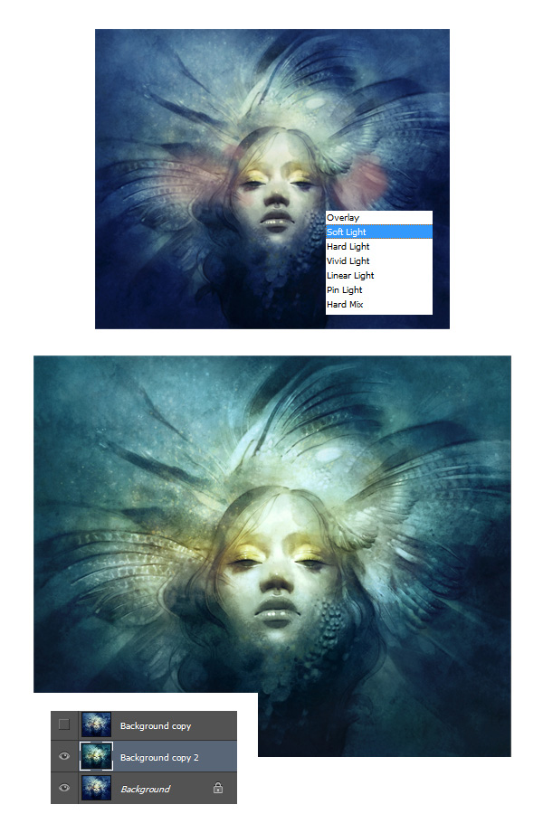
20. Remember to Zoom Into Your Work
I zoom in closely and continue the busy work. I begin at the top right of the painting and continue left until I refine the entire piece. At this point, I make sure there aren't any sharp, floating lines left over from placing the textures.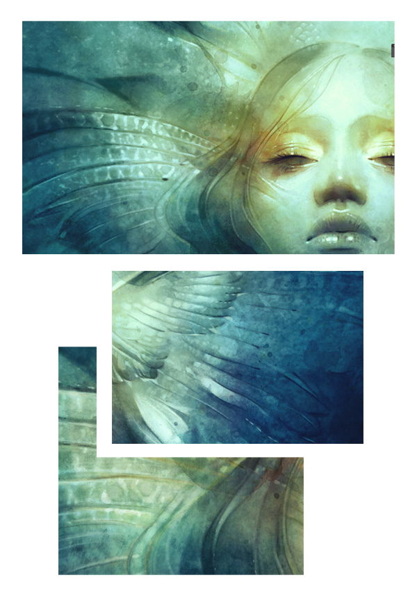
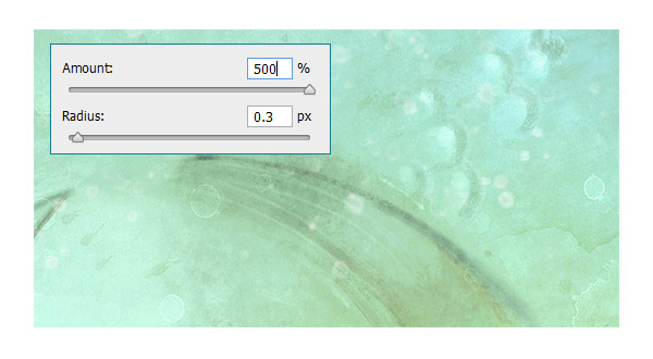
21. Sharpen Your Composition
Now onto the final touch. I choose Filter > Sharpen > Smart Sharpen and adjust the settings.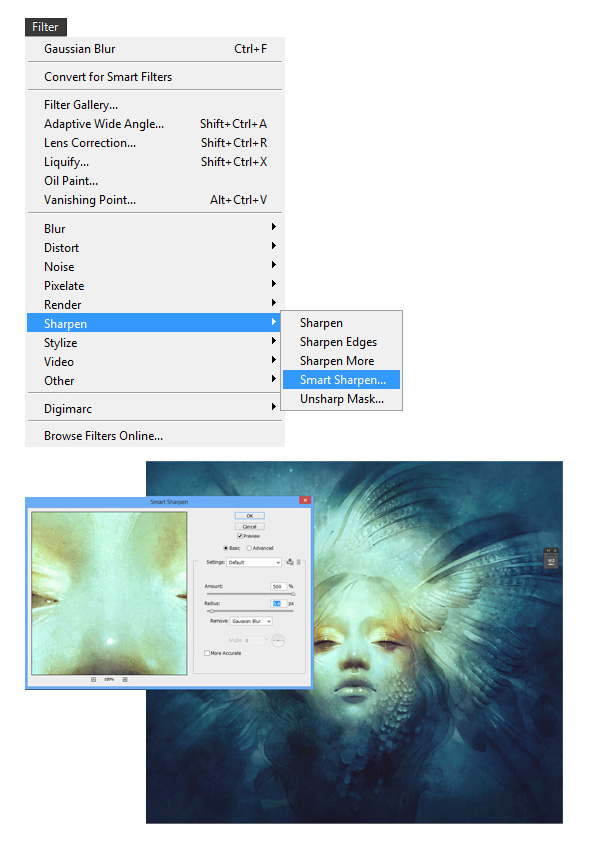
22. View Variations to Pick the Best One for You
Yay, almost done! As always my nit-picky side kicks in, and I create a few color variations to choose from. I like playing with saturation and contrast using Image > Adjustments > Vibrance. These are subtle changes, but it can take me ages to finally decide on something.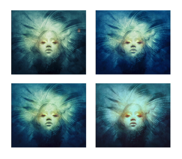
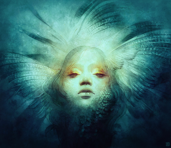
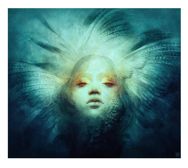
The Portrait is Complete!
I opt for a green color scheme with hints of red and yellow, drop in my signature, and call it a day!I hope this tutorial was in any way helpful! My goal was to shed light on how I create faces and digitally use textures and brushes. I know I'm only scratching the surface of all the possibilities, and look forward to even more experimentation. Happy painting, and good luck with your art.

0 comments:
Post a Comment