Illustrate | Free Graphics Design Collection and Tutorials
Showing posts with label Illustrate. Show all posts

Quick Tip: Create a Simple Seashell in Adobe Illustrator

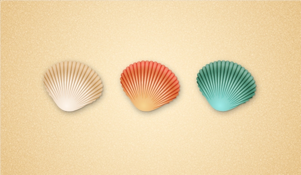
Final product image
What You'll Be Creating

In this new quick tip you will learn how to create a simple seashell in Adobe Illustrator.
You will begin with the shape of the seashell which is made using basic shapes, the Rotate option and the Pathfinder panel. To add more depth, you will add two types of shading and also highlights on the surface of the seashell.
At the end, you will color the seashells using different gradients and add the shadows. Let’s begin!
Launch Illustrator and go to File > New in order to open a blank document.
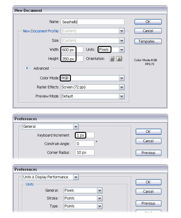
Type a name and set up the dimensions then select Pixels as Units and RGB as Color Mode. Next, go to Edit > Preferences > General and set the Keyboard Increment to 1px then go to Units & Display Performance and make sure that the Units are as indicated. I usually work with these settings and they will help you throughout the drawing process.
Grab the Rectangle Tool (M) and draw a 2 x 97px rectangle then give it a stroke using the color of your choice. Now, zoom on the top part of the rectangle then grab the Add Anchor Point Tool (+) and use it to add an extra point in the middle as shown in the close-up. Do the same thing at the bottom of the rectangle.
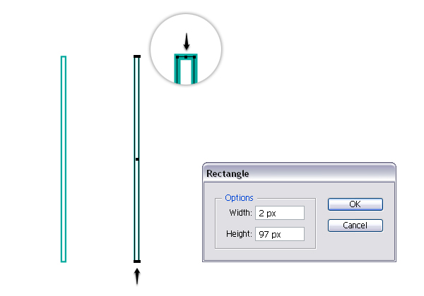
Use the Direct Selection Tool (A) to select only the point added earlier and move it upwards 4px by pressing the Up Arrow Key on your keyboard four times. Still having this point selected, press the Convert selected anchor points to smooth icon in the Control panel. Don’t forget about the bottom of the rectangle and repeat the same things.
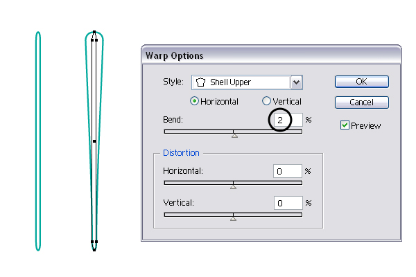
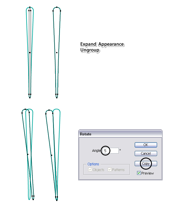
Having your rounded rectangle selected, go to Effect > Warp > Shell Upper. Apply a 2% Horizontal Bend and hit OK
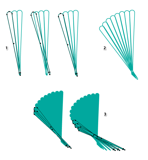
In order to expand the effect that you have applied, go to Object menu and select Expand Appearance then Ungroup (Shift-Control-G). I will name the shape obtained “first-rib”. While this shape stays selected, go to Object > Transform > Rotate and select a 5 degrees Angle then hit Copy. You will get a second “rib” on top but you need to move it to the left a little, right next to the first.
Now, select the second “rib” (1) then go to Object > Transform > Rotate, apply again a 5 degrees Angle and hit Copy. You will get the third “rib” (2) that you have to move in the right place, to the left and a little down (3). These ribs must be right next to each other even to overlap a bit but definitely without gaps between them.
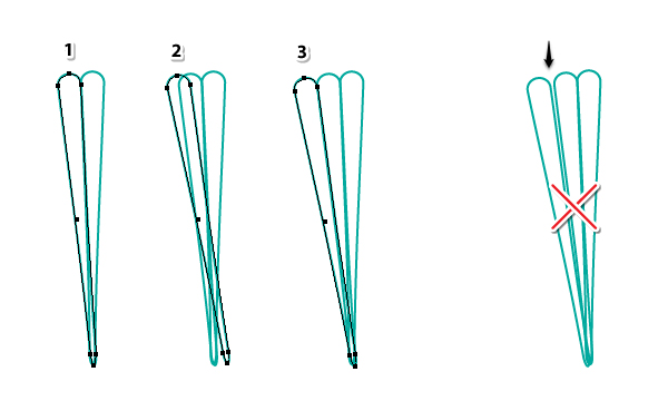
You get the point. Now, select the third “rib” and rotate it 5 degrees to get the next one (1). Move it to its place then continue to do the same thing (2). Once you get at the bottom, you can overlap the last few shapes in order to get smaller “ribs” (3). At this point I’ve switched to a green fill so you can see better the shape of the seashell coming together. Don’t worry about the bottom of the seashell because you will fix that later.
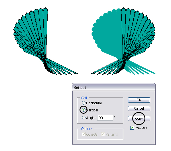
Now, select all the shapes from the left side and reflect them to the other side by going to Object > Transform > Reflect. Check Vertical and hit Copy. Make extra adjustments if needed.
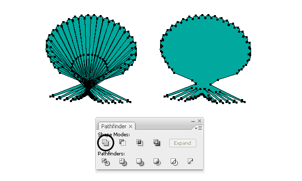
Next, select everything and press Add in the Pathfinder panel in order to get a single shape.
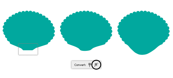
Grab the Pen Tool (P) or the Line Segment Tool (\) and draw a straight path as shown in the following image. Select the green shape and the line and press Divide in the Pathfinder panel then Ungroup (Shift-Control-G). Delete the shape at the bottom because you don’t need it.
Use the Direct Selection Tool (A) to drag a selection over the points at the bottom of the seashell and press the Convert selected anchor points to smooth icon in the Control panel. This will generate the handles and now you can move them downwards to create the rounded bottom. Now the shape of the seashell is ready.
Grab the Star Tool and draw a small triangle then switch to the Delete Anchor Point Tool (-) and remove the three points indicated on its sides. Next, use the Direct Selection Tool (A) to select only the bottom point and go to Object > Transform > Move. There, type -64px in the Vertical field and hit OK.
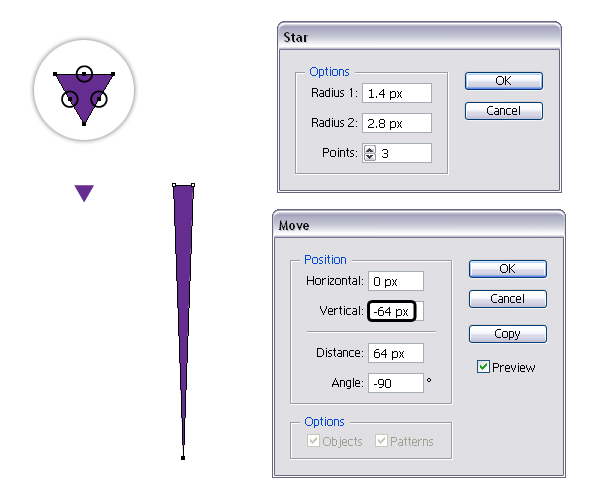
Now, take the Pen Tool (P) and draw a rhombus like shape at the top as in the next image (1). Select both shapes and press Add in the Pathfinder panel in order to create a single shape (2). Use the Convert Anchor Point Tool (Shift-C) to transform the two inner points indicated in the close-up from corner to smooth (3). You need that area to be rounded but everything will make sense in the following steps. I will name this shape “light-shading-shape”.
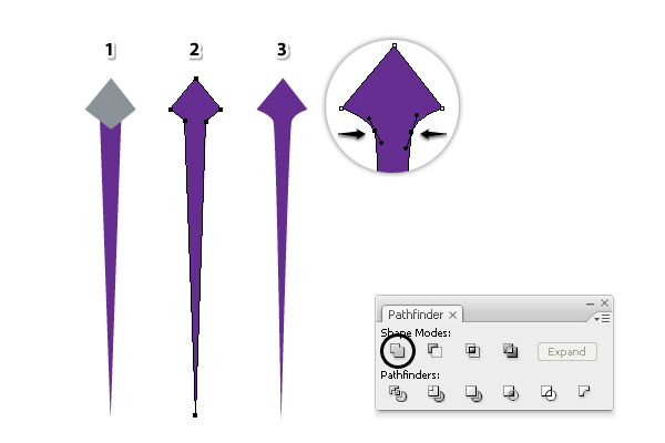
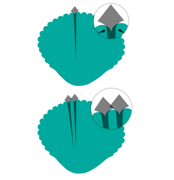
Move the shape that you have obtained at the previous step over the seashell and arrange it right between the “ribs”. The rounded area that I’ve talked about earlier should partially cover the top part of the “ribs” as in the close-up. I’ve set the Opacity of the light-shading-shape to 50% so you can see exactly where they overlap but you don’t have to, it’s just for visual purposes.
Next, make a copy of this shape then rotate slightly and arrange it between the next two “ribs”.
Continue to make more copies of the light-shading-shape, rotate accordingly and arrange them between the “ribs”. After the left side of the seashell is done (1) you can do the same thing on the right side (2).
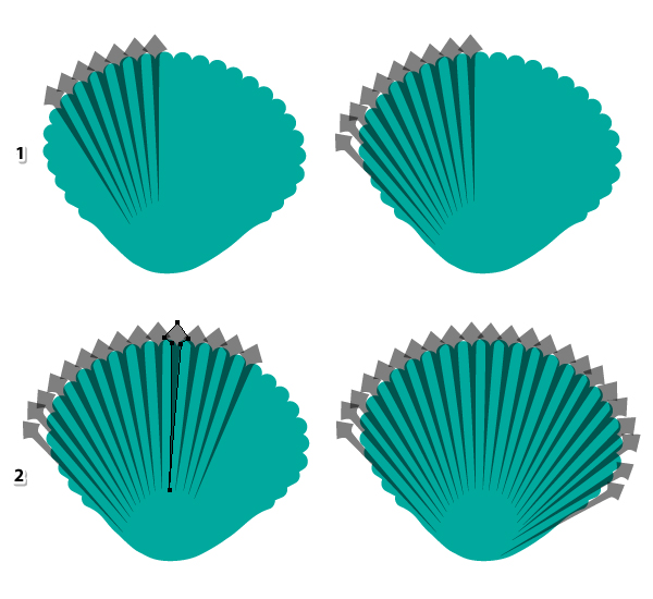
At this point, use the Direct Selection Tool (A) to select the end point of one of the shapes and you can make it a little shorter or a little longer. Repeat with the rest. The goal here is that the light-shading-shapes to have different lengths at the bottom. 
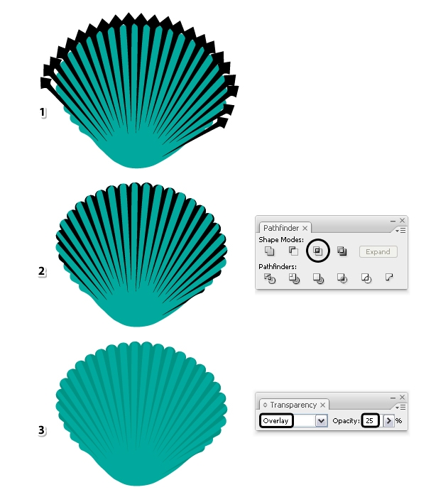
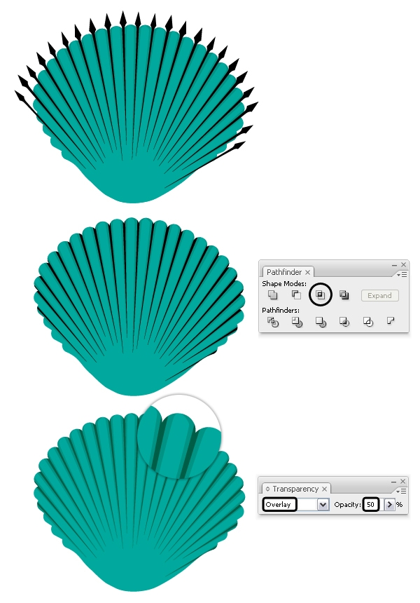
The Opacity is set back to 100% now. Copy and Paste in Front (Control-F) the seashell then select all light-shading-shapes and Group (Control-G) them (1). Before you continue make a copy of this group because you will need it at the next step. Now, select the group of shapes along with the copy of the seashell and press Intersect in the Pathfinder panel (2). Set the resulting shape to Blending mode Overlay and 25% Opacity while having a black fill (3).
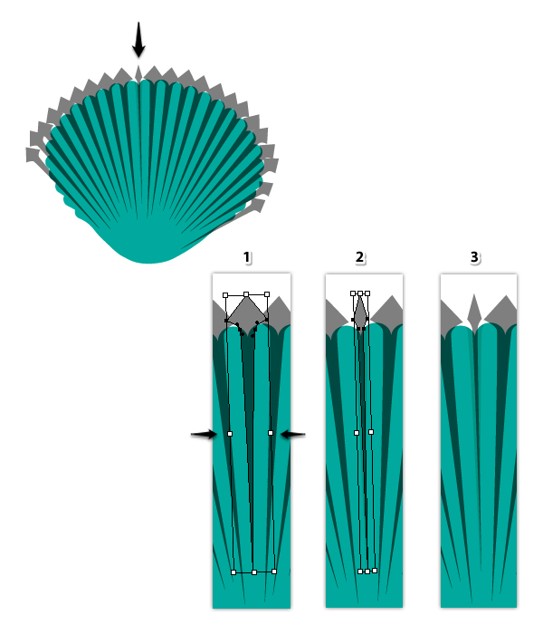
The light shading is done but we need more depth. Grab the copy of the group that you’ve made at the previous step and move it in front of everything. Ungroup (Shift-Control-G) them first then select one of the shapes with the Selection Tool (1) and make it thinner by squeezing the bounding box (2). You can see the end result in the third close-up.
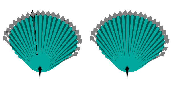
Continue to squeeze the rest of the shapes. They must be in line with the original ones but thinner.
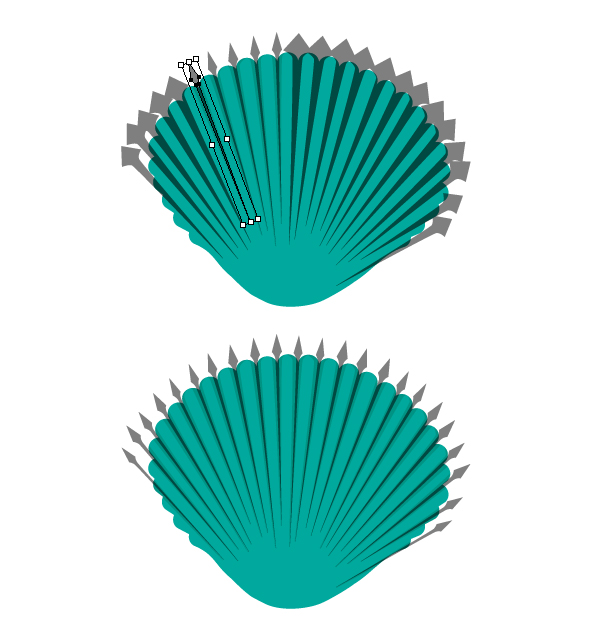
Select black as the fill color for these thinner shapes then Group (Control-G) them. Copy and Paste in Front (Control-F) the seashell then select the group of shapes along with the copy of the seashell and press Intersect in the Pathfinder panel. Set the resulting shape to Blending mode Overlay and 50% Opacity. This is more of a deep shading compared with the first.
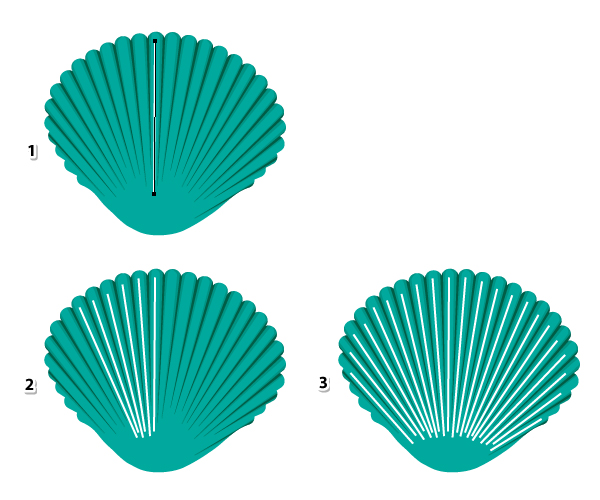
Grab the Pen Tool (P) or the Line Segment Tool (\) and draw a path through the middle of one of the “ribs” (1). Continue to draw other paths, one for each “rib” of the seashell (3).
Stroke all these paths with an Art Brush called “Tapered – Round” that you can find in Brush Libraries Menu > Artistic > Artistic_Ink. Still having these lines selected, go to the Appearance panel and double click on the brush stroke applied to open the Stroke Options window. Type 15% in the Width field and hit OK. Make sure that the tip of the brush is downwards otherwise check Flip Along also.
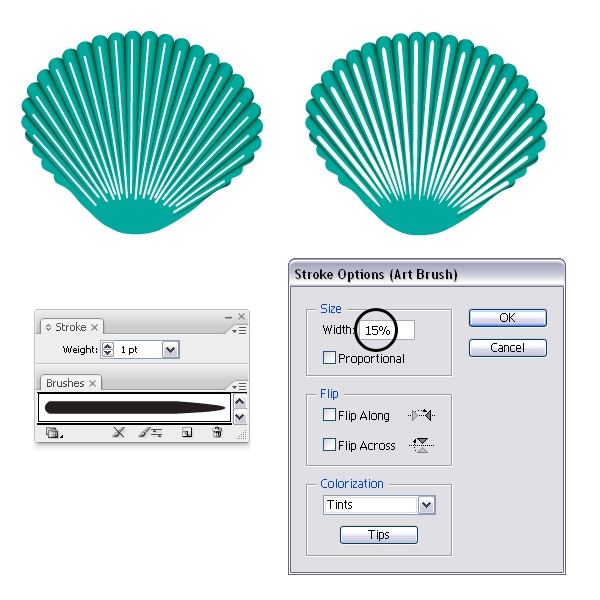
You should decrease the width of the brush for the paths on the sides of the seashell. Keep the Width for the paths in the middle as it was set at the previous step, 15% (1). Select the next few paths then open the Stroke Options window and set the Width at 12% (2). Select the next paths and decrease the width a little more as you rich the sides of the seashell (3). For the remaining paths set the Width at 5-7%.
While the stroked paths are selected, select Expand Appearance from the Object menu then Ungroup (Shift-Control-G) twice (1). Fill all resulting shapes with a white to black radial gradient (2) then set the Blending mode to Screen (black becomes transparent) and 50% Opacity. You can Group (Control-G) them at this point (3).
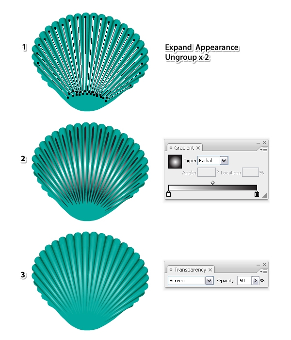
Select the shape of the seashell and replace the existing fill color with the radial gradient shown. Use the Gradient Tool (G) to change the radius.
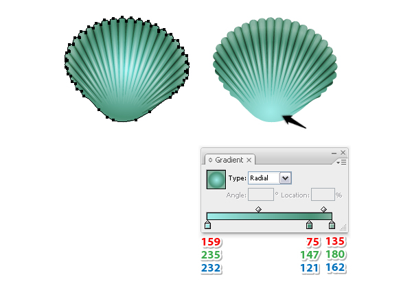
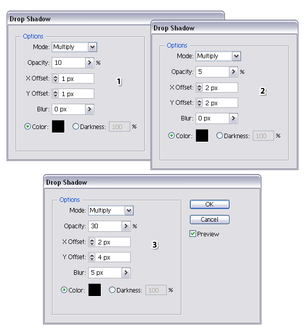
While the seashell stays selected, go to the Appearance panel and select the existing gradient fill then press the Duplicate selected items icon. Select the new fill from the bottom then go to Effect > Stylize and apply the Drop Shadow effect. You can see the settings that I’ve used below.
Select this new fill (1) in the Appearance panel and press the Duplicate selected items icon again. You will get another fill at the bottom (2) and now, double click on the Drop Shadow effect to open the window and change the settings. Duplicate the fill one more time then open the Drop Shadow window again and change the settings (3).
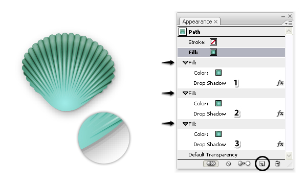
These are the Drop Shadow settings that I’ve used for the three fill attributes.
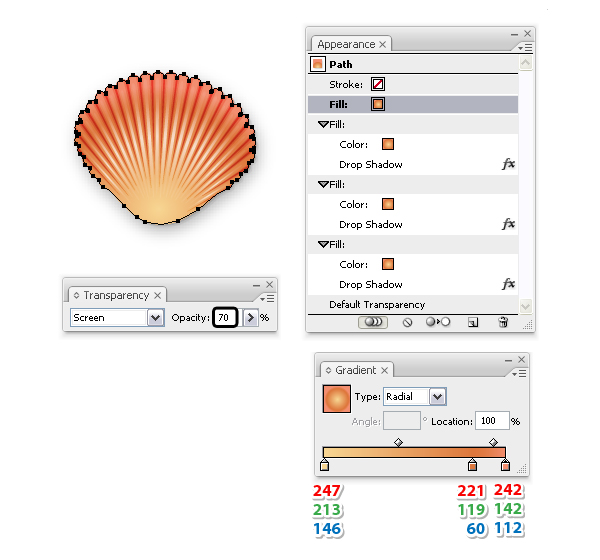
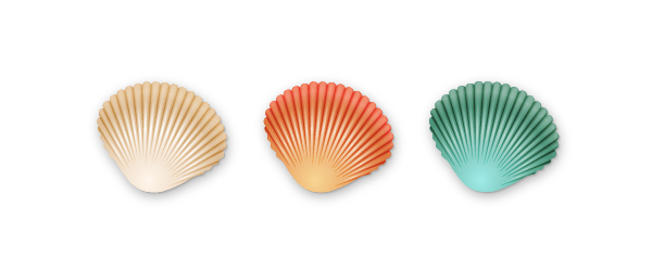
The green seashell is ready and now you can create more seashells of different colors. Make a copy of the first seashell then replace the existing green gradient with one using shades of orange. Because you are using brighter colors, you can increase the Opacity for the group of highlights from 50% to 70% (step 4.4). 
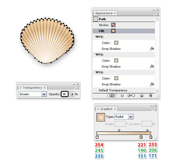
Here is another version. Make one more copy of the first seashell then replace the existing gradient with the one shown below. The highlights are barely visible at this point since you are using lighter colors therefore increase the Opacity of the group from 50% to 90%.
Advertisement
You are finished are here are the three seashells that we have created.
I hope you have found this quick tip useful. You can use these seashells in your illustrations this summer and if you decide to make them, please share your version with us. I would love to see other colors.

Illustrate a Dramatic, Feather-Infused Portrait in Adobe Photoshop

Final product image
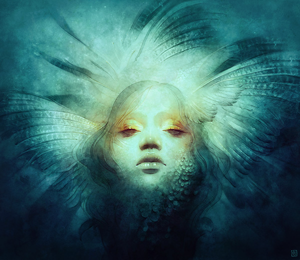
Portraits make for a fascinating subject, especially when combined with abstracted natural elements. In this tutorial, I share my portraiture method by painting an ethereal lady enveloped by feathers. My tools of choice are Adobe Photoshop CS6 and my Wacom Tablet (Intuos 3). From sketch to final, I describe various techniques for creating atmosphere, color, texture and detail. Under the 'Assets' section, I include a few of my favorite custom brushes and textures mentioned in the tutorial. My process is fairly painterly and I use few layers, merging constantly. Compiling and condensing the material was lots of fun - I hope you enjoy as well!

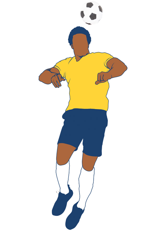
Create a Retro Footballer in Adobe Illustrator for the World Cup

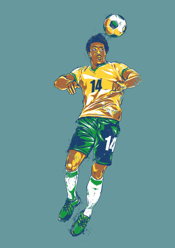
Final product image

Love football? The 2014 World Cup in Brazil starts today! In this tutorial, I decided to create a bright illustration with a retro style effect but with a nod to the hosting teams colors, all in Adobe Illustrator.
You will need: Adobe Illustrator, a stock photo of a footballer and a graphics tablet.
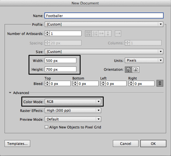
Lets create a New Document in Adobe Illustrator with following settings.


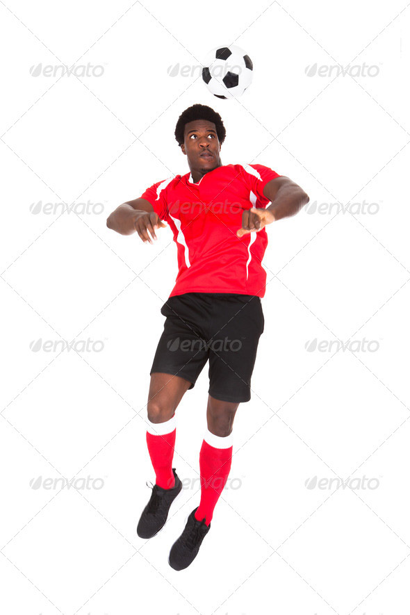
You need some picture of footballer to be used as derivative. I found amazing image on Photodune. There are a lot of photos with football players available, however I picked this one because it has nice lighting and a good dynamic pose.


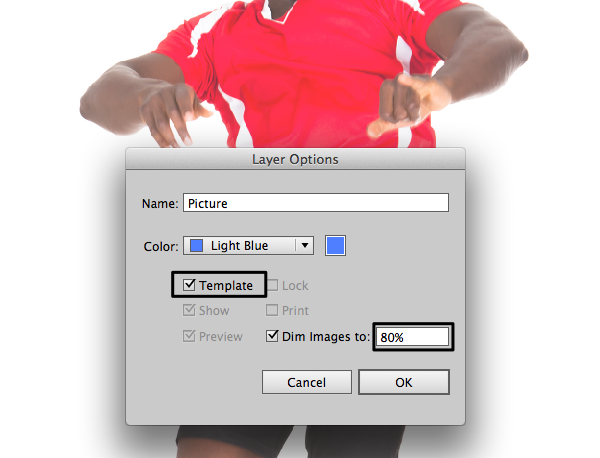
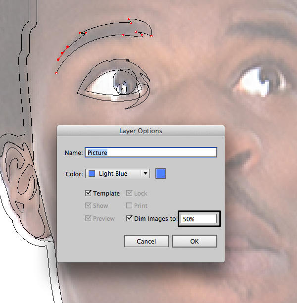
Drag and drop your picture on the current layer. Open the Layer Settings by clicking double on this layer. Rename it as Picture and use the following settings.


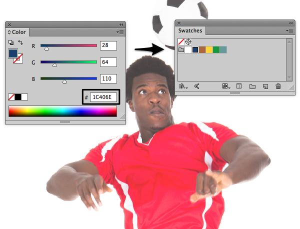
Let's create and add some retro colors in the Swatches panel. The colors have to be strong, contrasting and bright. Go to the Color panel and play with the RGB settings.

I'll be using a deep blue retro color. Nice for shadows and contours. Lets create and add a few more colors. These are the codes for the colors I'll be using: #FFFFFF, #AB673D#AB673D, #FFD438, #179840, #66999C. You can use them or create your own.
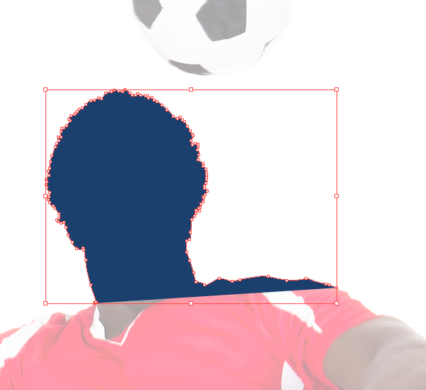
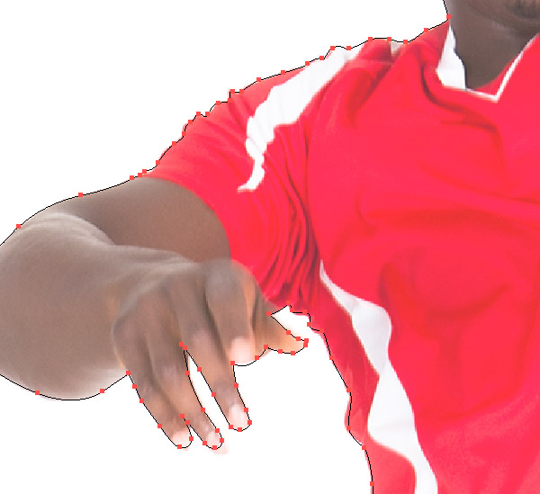
Create a New Layer above the stock image layer. Choose the dark blue color as Fill color. Lets create the main contour shape with Pen Tool (P).

Pay attention to details. But don't make the shape too smooth. Sharp angles give a good old school effect.
Use Preview mode (View > Preview) to see outlines only. Its great way to make this process much easier.


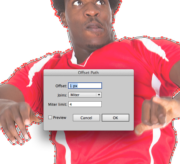
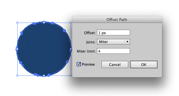
When you have finished with the main shape select it and create one more contour by going to Object > Path > Offset Path. Lock the generated path (Object > Lock > Selection).


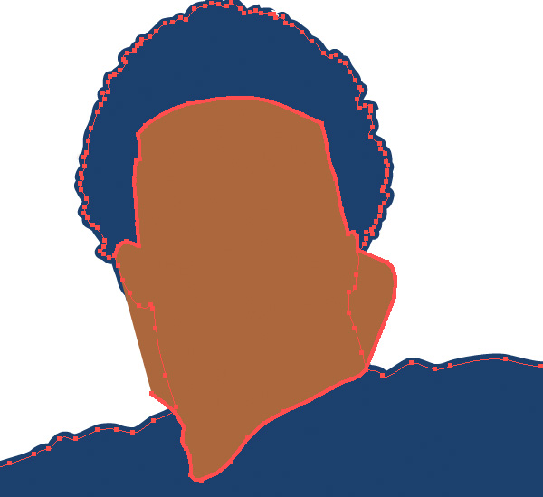
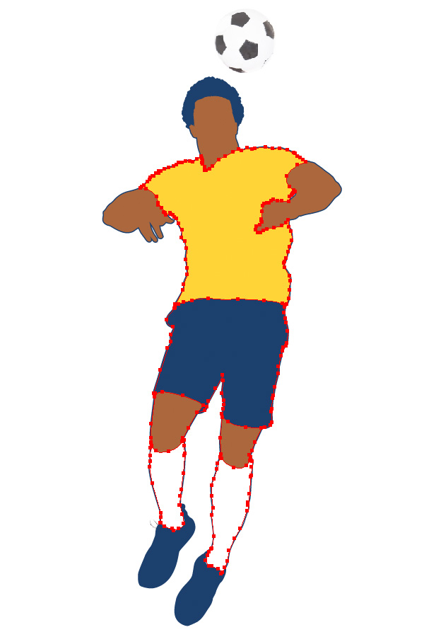
Let's divide the original shape into several basic parts: head, hands, feet and clothes. Still using the Pen Tool (P) create a new shape of the face above the main shape.

Create the hands, legs and clothes elements the same way.
Actually it's not required for the shapes to be closed. You can just make some contour lines in the areas where the main shape will be divided.

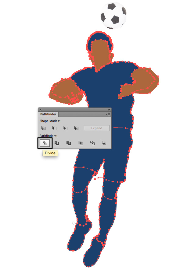
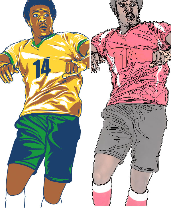
After that, select all shapes (except offset and locked one of course) and click the Divide button in the Pathfinder panel. Then Ungroup (Object > Ungroup) this all and remove any unnecessary stay objects.

Select each piece and change the Fill color using the swatches you created before.


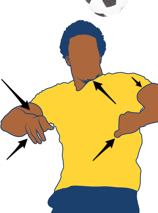
Add more deep blue contours in the places which needs strong contrast.

Offset Path of each piece again (just like you have done before in Step 2) to get fast extra contour shapes. Use the Pen Tool (P) to create some lines on the hands and finger areas.


This part of work is most laborious. But at the same time it's the most fun and interesting.
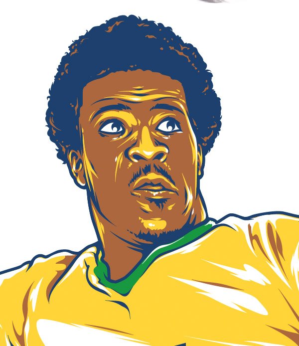
Starting from the top let's create face details using the Pen Tool (P). The Fill color is still deep blue. I decided to drop down the opacity level in Picture layer options to have better Preview.

Continue to add details around the face.


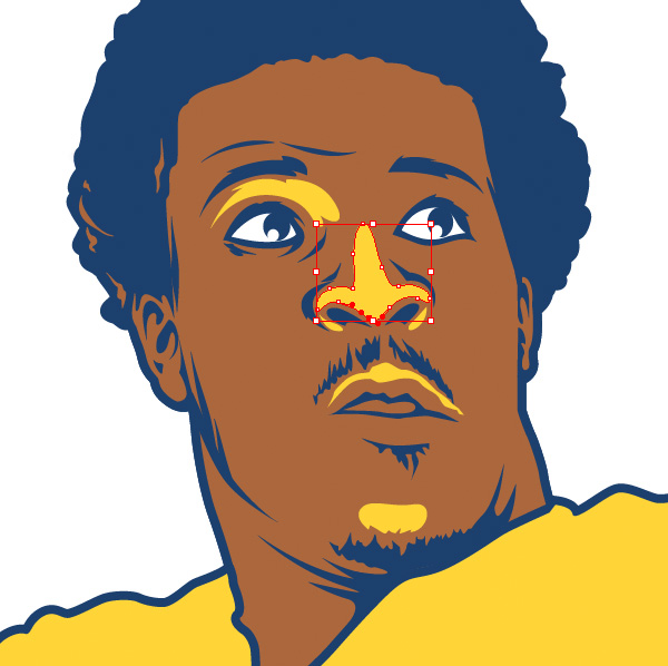
Choose the yellow color for the fill and create the midtones areas. Don't forget to switch Preview mode all the time to see where you have to put this yellow color.


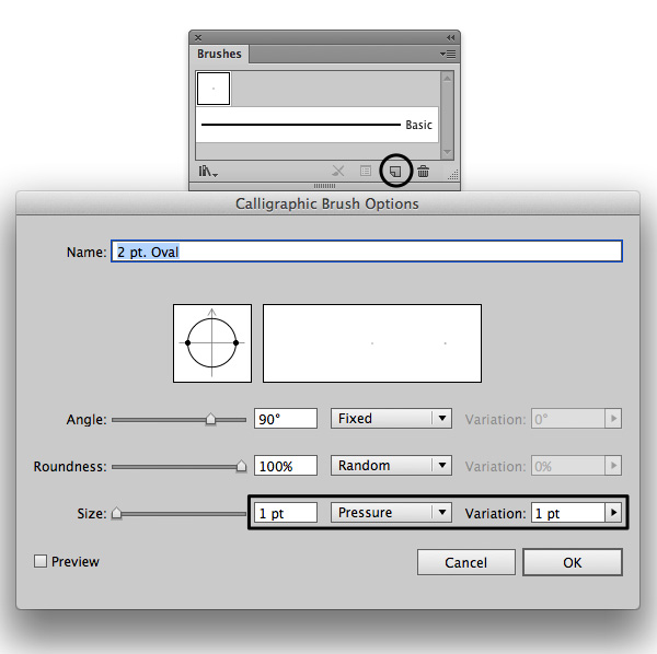
Create a Calligraphic Brush for stylish artistic lines to make your artwork more detailed. Click the New Brush button in the Brushes panel and use the following settings.

Continue drawing using your graphics tablet. Experiment with pressure: some lines have to be thin, some lines need to be thick. If sometime you feel the need to use the Pen Tool - feel free to use it. As you can see on picture below I was using the Pen Tool for the larger areas, and Brush - for the line shaped thin areas.
This is important part of work when you realizing how exactly your whole image looks like. The style your details have to be kept  through the whole work process.

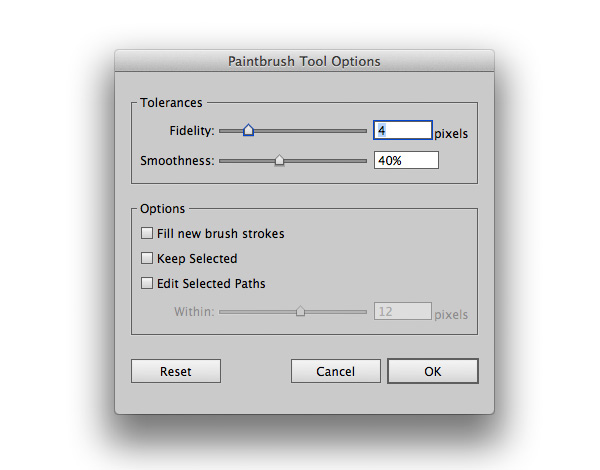
If you're not happy with your Brush drawing results try to change this settings (press Enter). I was using these:

Also check out your Graphics Tablet settings. I have got Pressure Intensity set up on the hardest level to have the best pressure control.
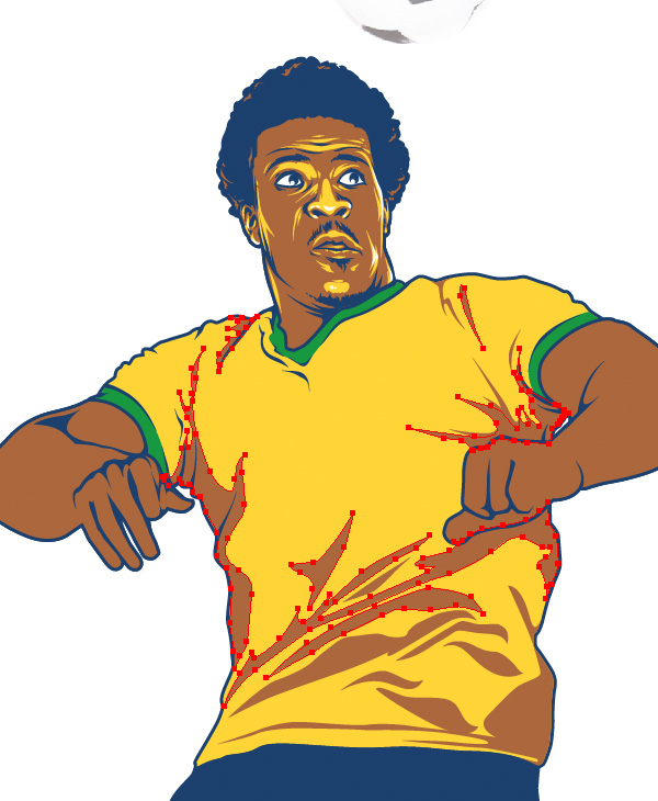
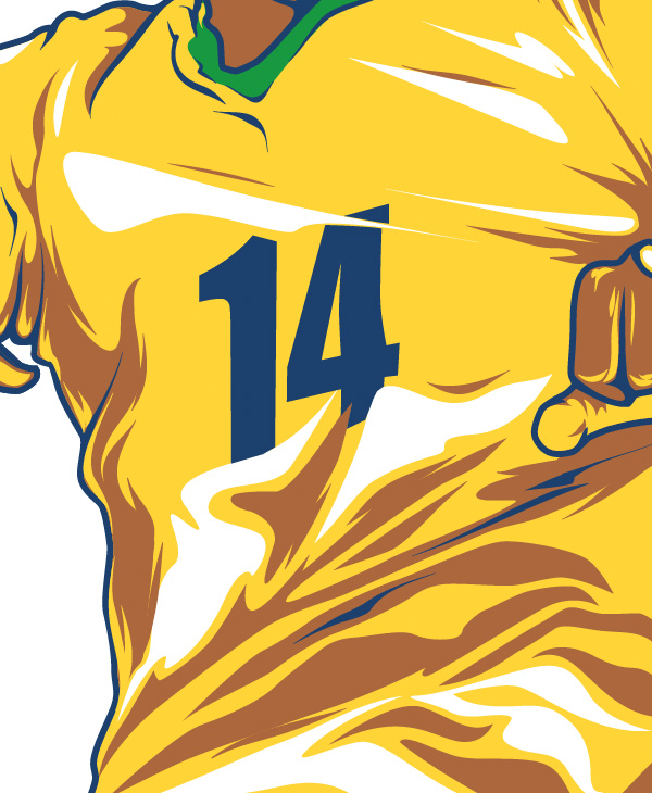
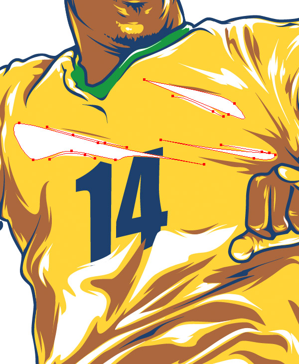
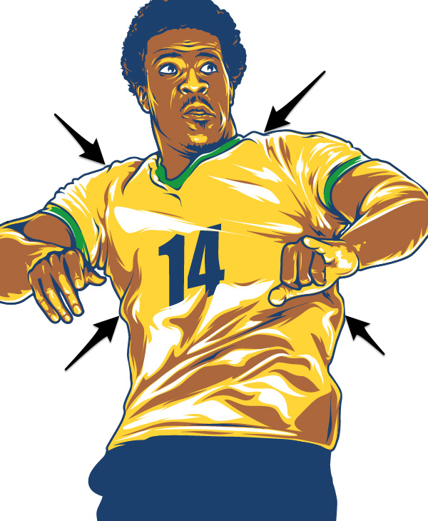
Add contour lights on hair with a brown color and some highlights on face using white. Continue going down and add shadows on t-shirt. Again use the Pen Tool for big solid areas and Brush for more detailed thin lines.

Add highlights as well.


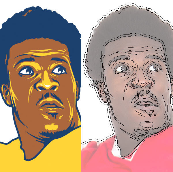
There is a great way to make your shadows and highlights areas more detailed and stylish. Add sharp contiguous lines here and there just like I've done on pictures below.

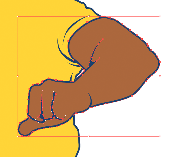
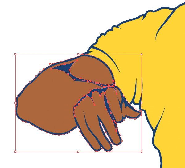
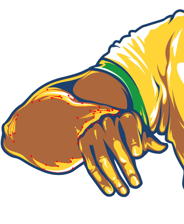
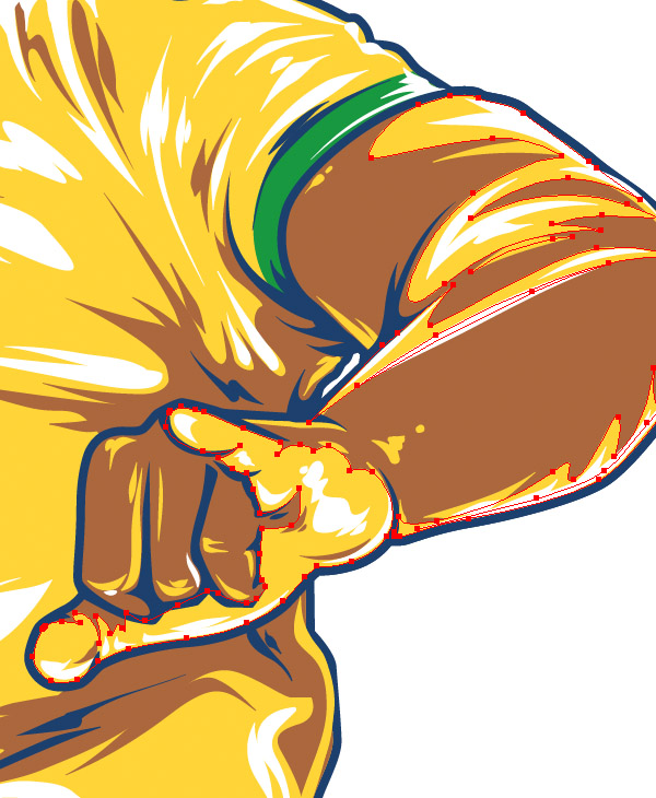
Look how I created the yellow midtones and white highlights on the hands. Do it same way: somewhere with Pen Tool and somewhere with Brush.


Pay attention to contour lights - thin lines on the sides. These lines gives great contrast. Create them using the Paintbrush Tool (B).


Continue going down with details. Add green midtones and white highlights on the shorts.

Create a Retro Footballer in Adobe Illustrator for the World Cup
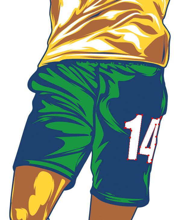
Add a number on the shorts too. Distort it with the Warp Tool and Direct Selection Tool (A).

Create a Retro Footballer in Adobe Illustrator for the World Cup

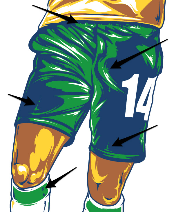
Still using the Paintbrush Tool add some decorative thin lines and little dots here and there to make illustration be more textured.

Create a Retro Footballer in Adobe Illustrator for the World Cup

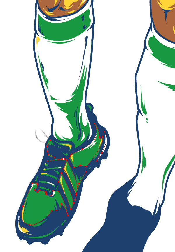
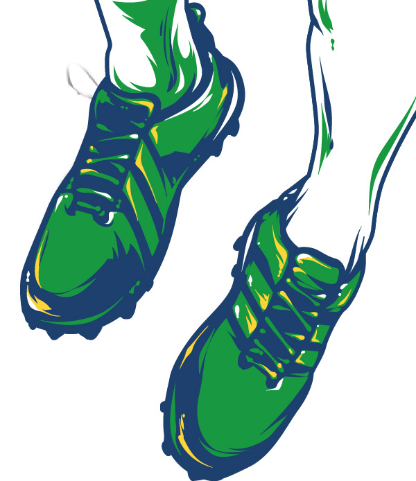
Draw some lines on the gaiters and move to the shoes.

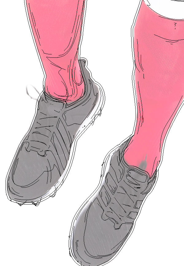
I was drawing blind because the shoes in derivative picture are black. Its almost solid black: poor midtones and highlights. That means sometimes you have to be extra creative and run with your imagination.

Create a Retro Footballer in Adobe Illustrator for the World Cup

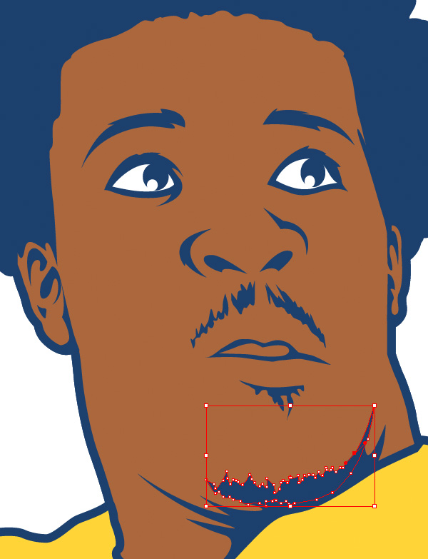
Add the finishing touches: contrast lines, decorative dots, little scribbles.  I add more curls to the hair, some wet drops on the face, few extra lines to the mustache and barb.

Create a Retro Footballer in Adobe Illustrator for the World Cup
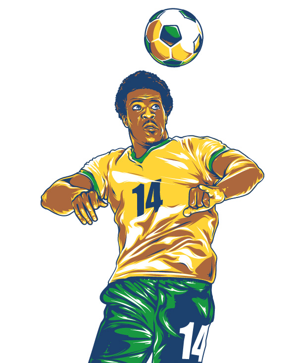
And finally we got cool bright retro styled footballer! Something is missing... oh yeah, the ball!

Create a Retro Footballer in Adobe Illustrator for the World Cup

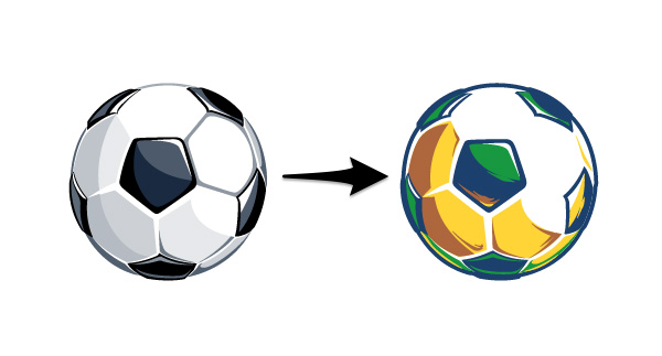
You can create the ball same way you've done before with footballer. Nothing special. But I actually was using my old vector ball I created a long time ago. But it still works, and I'm gonna show you how.


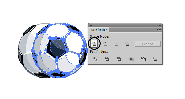
Copy-paste the ball. Select the copy and press Unite button.


Fill the result shape with deep blue color from your Swatches panel. Offset this path going to Object > Path > Offset Path (with the same setting as for footballer). Paste the resulting path to the back (Object > Arrange > Send to Back).

Create a Retro Footballer in Adobe Illustrator for the World Cup

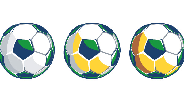
Ungroup the ball on top and select all the black objects using Select > Same > Fill Color (but make sure you already selected at least one). And just change selected shapes black color to deep blue.

Select all dark grey shapes and change their fill to green. Use this technique to change light grey to yellow and middle grey to brown.

Create a Retro Footballer in Adobe Illustrator for the World Cup

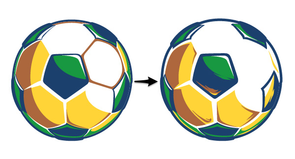
Remove excess shapes and add extra lines using the Paintbrush Tool.

Create a Retro Footballer in Adobe Illustrator for the World Cup

Move the ball closer to the man. Pay attention to the light direction. It has to be the same with footballer. In this case rotate the ball if you need.

Create a Retro Footballer in Adobe Illustrator for the World Cup

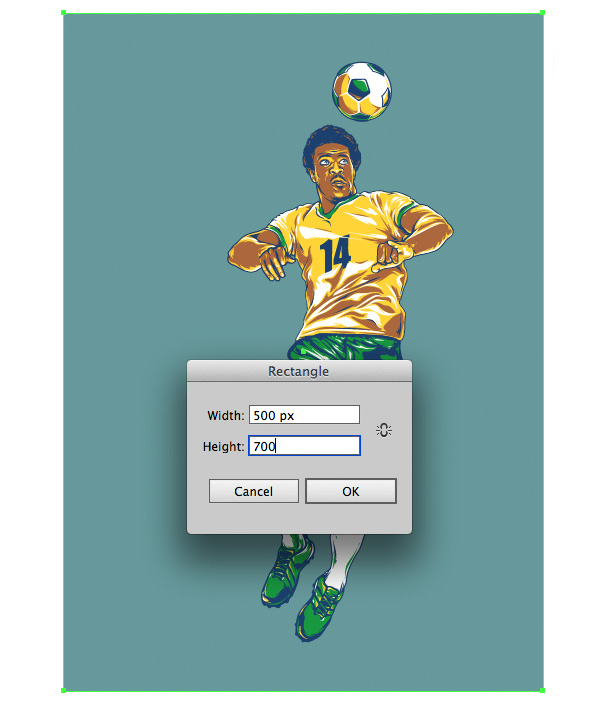
Go to the Layers panel and make Picture layer invisible. Create a New Layer above Picture. Choose the Rectangle Tool (M) and create a new rectangle 500 x 700 px. Fill it with #66999C.


Create a New Layer above all and paste there some vector dirty elements. I was using my old vector scratches. But if you have nothing to use, I will show how to create it fast.
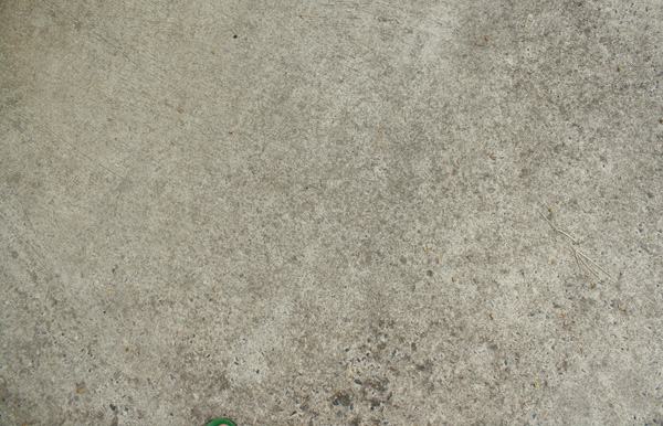
Just take your camera and make a few shots of walls in your place or get outside and make some photos of asphalt. Dirty and scratched surfaces work best for this.

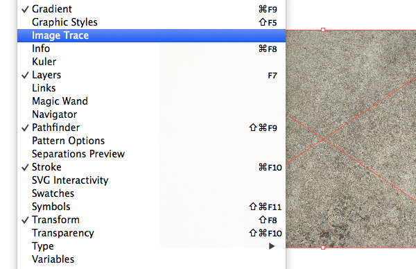
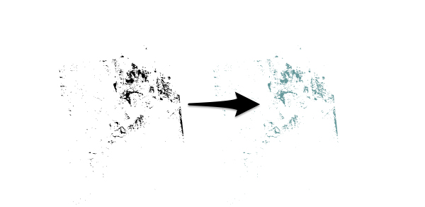
Drop your photo on the current layer, select it and go to Window > Image Trace.

Create a Retro Footballer in Adobe Illustrator for the World Cup
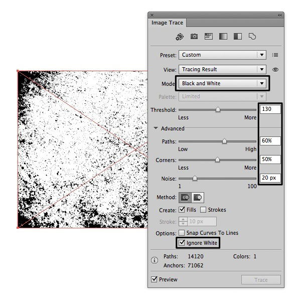
Play with controllers to get best result. I traced my picture with these settings:Create a Retro Footballer in Adobe Illustrator for the World Cup
Push the Trace button when you're done and Expand it in top main menu. After that there will be a group of vector elements. Thats it!
Change your dirty elements fill color to the same with background.

Create a Retro Footballer in Adobe Illustrator for the World Cup
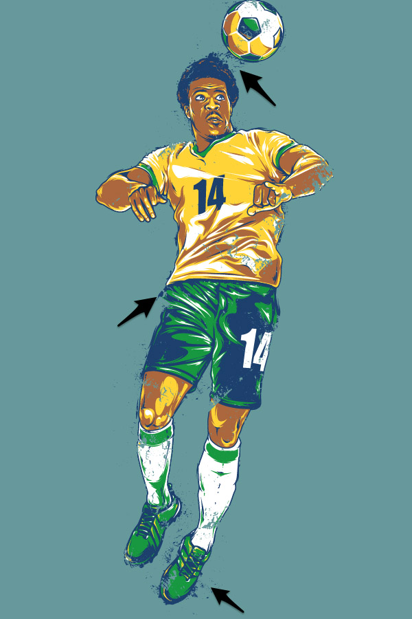
Drag, scale and rotate the copies of this dirt element around your illustration.

Create a Retro Footballer in Adobe Illustrator for the World Cup

Advertisement
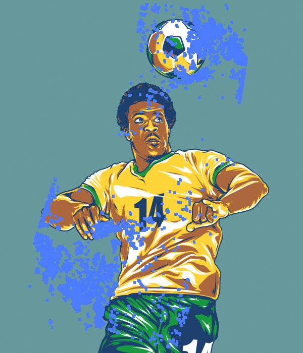
Finally add some extra lines and splashes to get weathered retro look.

Create a Retro Footballer in Adobe Illustrator for the World Cup

Your retro footballer illustration is complete! It's perfect to be used in a poster design. Or you just can put it to your desktop. I hope you enjoyed this tutorial and gained some new useful skills.

 
Powered by Blogger.